
Rebranding
|
Background:
As Marketing Manager I was responsible for the re-branding process of a national construction supplier, Harsco Infrastructure, following an organisation takeover. The rebarding required the new company to operate under three separately branded divisions; Hunnebeck for formwork, SGB for scaffolding and Brand for industrial services. |
Company:
Brand Energy & Infrastructure Services is an American company that merged with Harsco Infrastructure and generated three UK divisions branded Hunnebeck, SGB and Brand Energy & Infrastructure Services. |
|
Planning
Careful planning is at heart of each successful campaign. The timing is crucial and in this case the transfer between the old and the three new brands was allowed to take up to one year.
Re-branding activities driven by the name change (excluding legal documentation):
Careful planning is at heart of each successful campaign. The timing is crucial and in this case the transfer between the old and the three new brands was allowed to take up to one year.
Re-branding activities driven by the name change (excluding legal documentation):
- Website, including content
- Advertising
- Branch signage
- Direct mail
- Brochures
- Videos
- Social media
- Uniforms
- Press release
- Email signature
- Promotional merchandise
- Internal communication & documentation

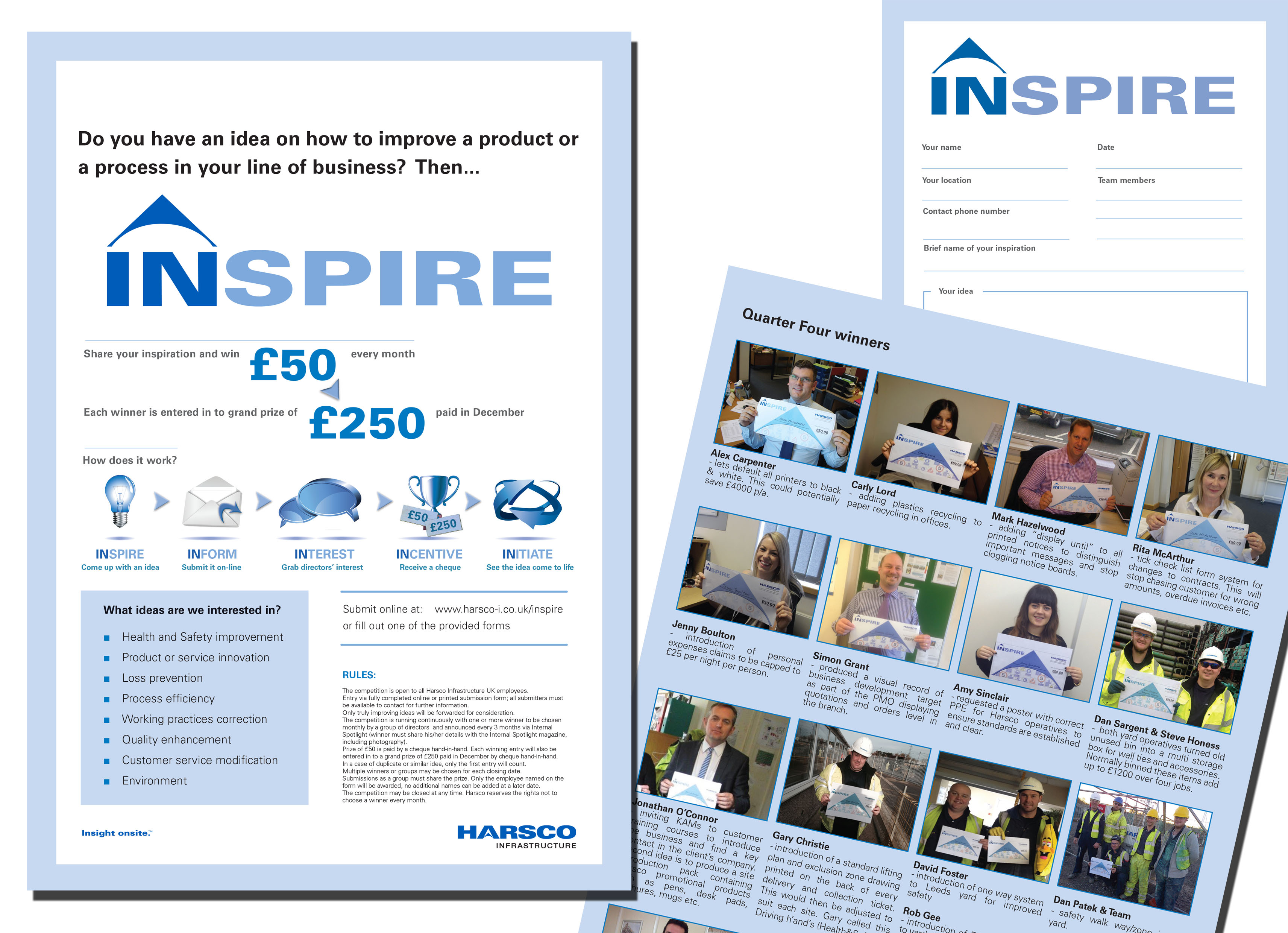
Prepare the audience - Teaser Campaign
The teaser campaign was designed to warm up the audience instead of shocking it with a sudden announcement. This type of a campaign was unique and hadn't been done in the construction industry before.
One element of the campaign was a "surprise box" which was featured on all advertisements, direct mails and website content. It was displayed for 3 months prior the name change, with the final month adding "not long now" to increase the tension.
The feedback was very positive and branch operatives received numerous queries from clients during this time creating a moment of anticipation.
During this stage all other items containing new brand were prepared.
Roll out
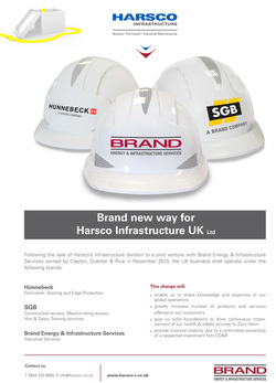
The roll out was announced by a press release followed by a series af adverts in construction magazines (below). The direct mail campaign to existing and purchased contacts contained basic facts and a digital leaflet (below) explaining the name change in more detail. This leaflet was also printed and distributed to branches and also included in outgoing post. The email signatures of all office based staff contained the announcement with a link to a new home page, which also contained details of the name change. Meanwhile all branches had new signage displayed on their site and employees received their new uniforms. Brochures were reprinted gradually as stock ran out to reduce cost and videos had to be re-rendered. Social media played a vital part as it allowed for instant news sharing. New merchandise was ordered and given to customers as a constant reminder of the change.
A crucial part of the campaign was the use of protective helmets displaying the new logos. These, as a symbol of construction, visually explained the focus of the three new brands while stressing the most important message, which is safety at heart of all these businesses.
Advert
The roll out advert was developed based on the magazine readership. Construction Industry magazines received the advert explaining the change and the emergence of three new brands. Magazines targeting certain industries, such as formwork, received an advert explaining the creation of a new division; replacing Harsco with Hunnebeck. All adverts had a similar feel, messages and retained the protective helmet idea. |
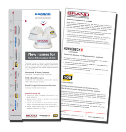
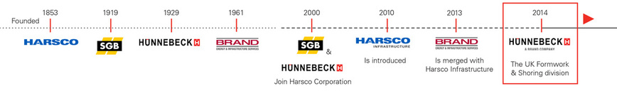
Leaflet
This leaflet was a handy and cheap way to spread the news. A clever timeline showed the long history of the business, explaining that the new brands have got heritage and long experience to gain trust from customers. The leaflets were also available digitally online. |